South Bristol Covid Map
Ever since the start of this coronavirus pandemic, I’ve wanted to know how bad the situation is in my local area and how it has evolved over time. There are quite a few online resources that will tell you how bad it is right now, but very few that offer a broader perspective. Back in April, I signed up with gov.uk to gain access to the raw data but the figures were patchy and dirty and hard to work with. I gave up. Recently, a lull in my workload led me back to Google and I discovered the Government’s interactive map. With a couple of hours playing around I managed to turn it into this animated GIF showing how Covid has evolved in South Bristol since July 2020.
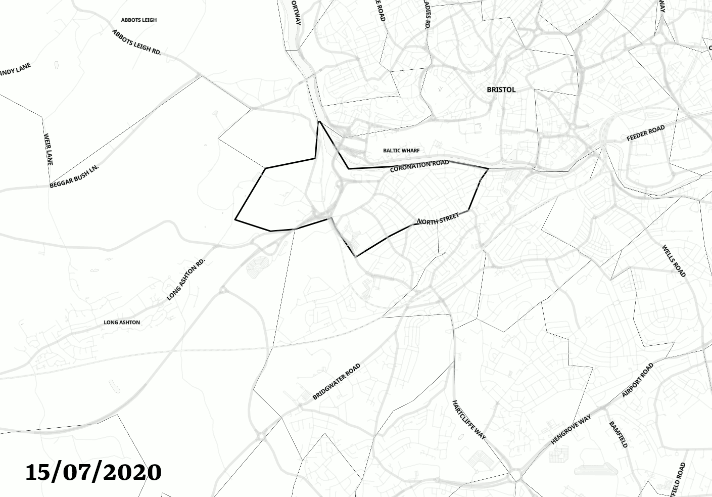
Click on the image for a full-size version
It’s interesting to see that, back in July, most of south Bristol was covid free, the first wave having passed. Towards the end of the summer cases started to increase drastically, until a lockdown was imposed in November. By the end of November, there were still cases but they were much reduced and manageable. Then Christmas and new variant… it’s not looking good, only Windmill Hill and Totterdown hold out against the virus.
I don’t know but I suspect the image is © Crown copyright 2020